Timeline
August - September 2025
Platform
Figma
Role
UX Design
UX Research
The Problem
Camping apps are not beginner friendly.
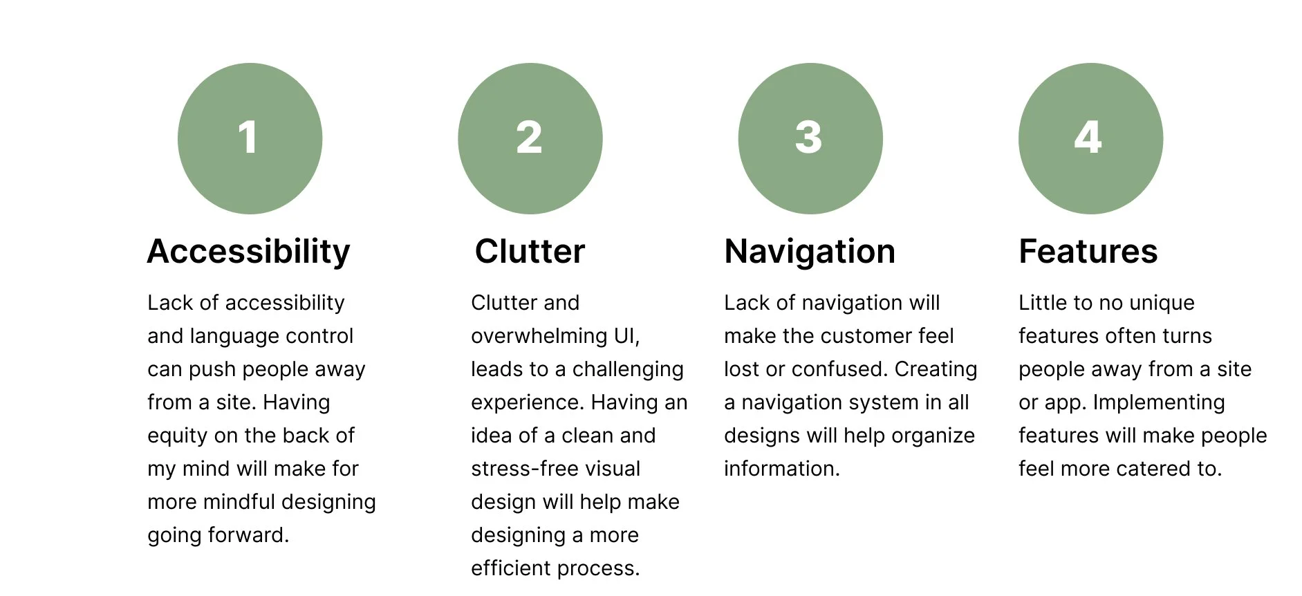
Camping apps are often not beginner-friendly or accessible, with complex interfaces, weak navigation, and inadequate guidance on where to start. This confusing experience often turns away beginner or even seasoned campers who need a systematic way to order their needs.
The Solution
A straightforward way to purchase your specific camping needs.

User Research: Pain Points
Aspects that hurt the user experience.
Through user interviews, existing user problems, and respectable online sources, I was able to list some common pain points users go through on most camping supply apps. I found that most people have had similar problems in the past, that being lots of app are typically overwhelming and lack community driven features.
User Research: Competitive Analysis
Competition had little community driven features.
I analyzed four of the most popular direct and indirect camping apps that have similar goals in mind. I found that most app’s unique value propositions were mainly memberships. While that is nice on paper, it isn’t very community orientated, which I believe is a missed opportunity.
User Research: User Personas
User Personas


User Research: Journey Map
User Journey Map for Michael Jones.
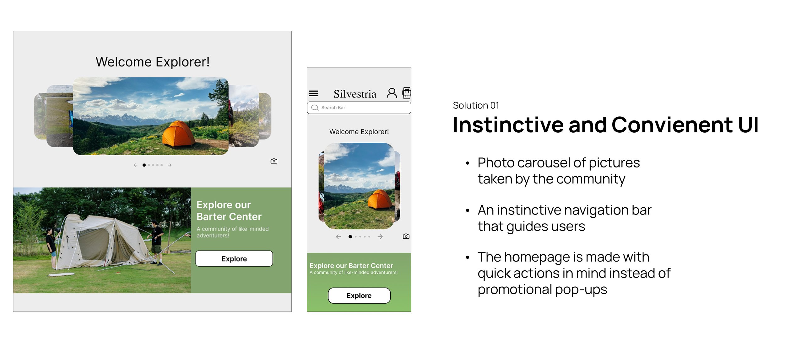
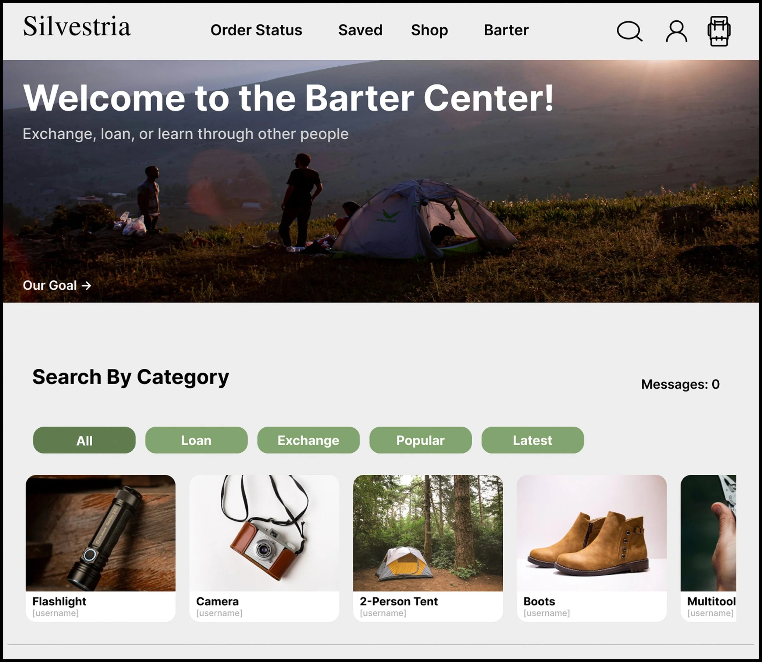
Navigation at the top of the screen. Includes the important sections of the website.
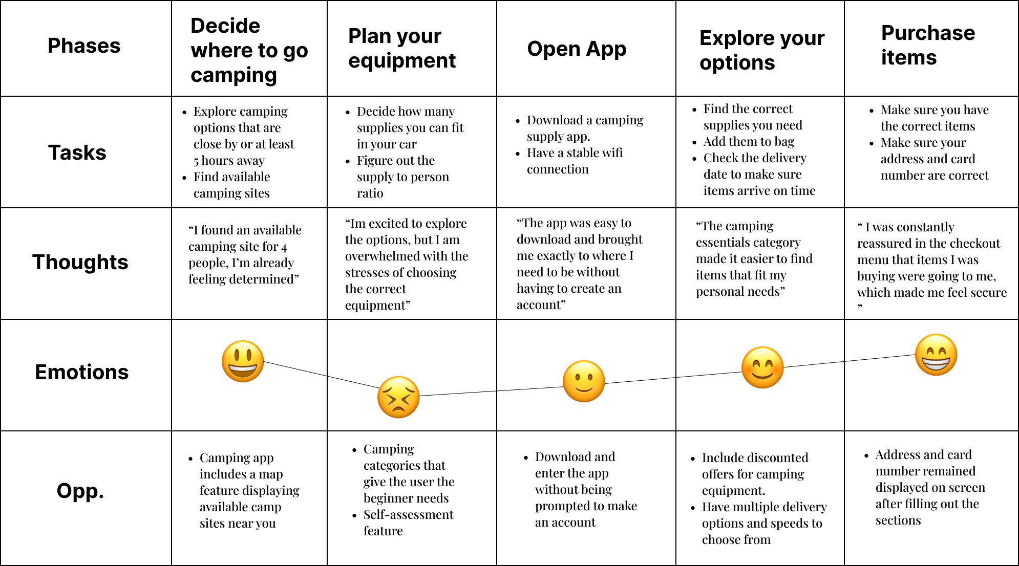
Barter center at the top of the screen so first time customers don’t have to go digging to find it. Helps repeatability for reoccurring users.
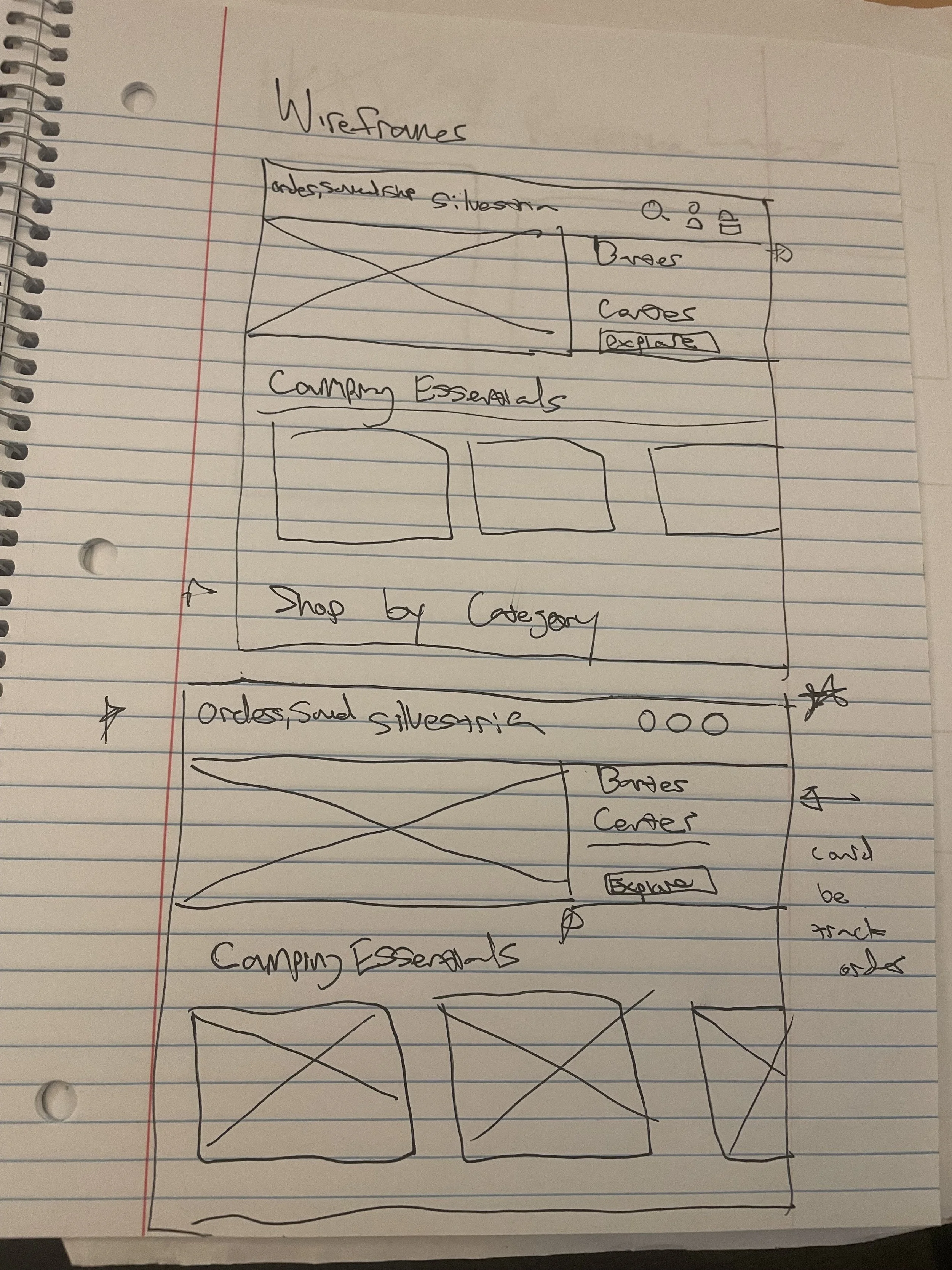
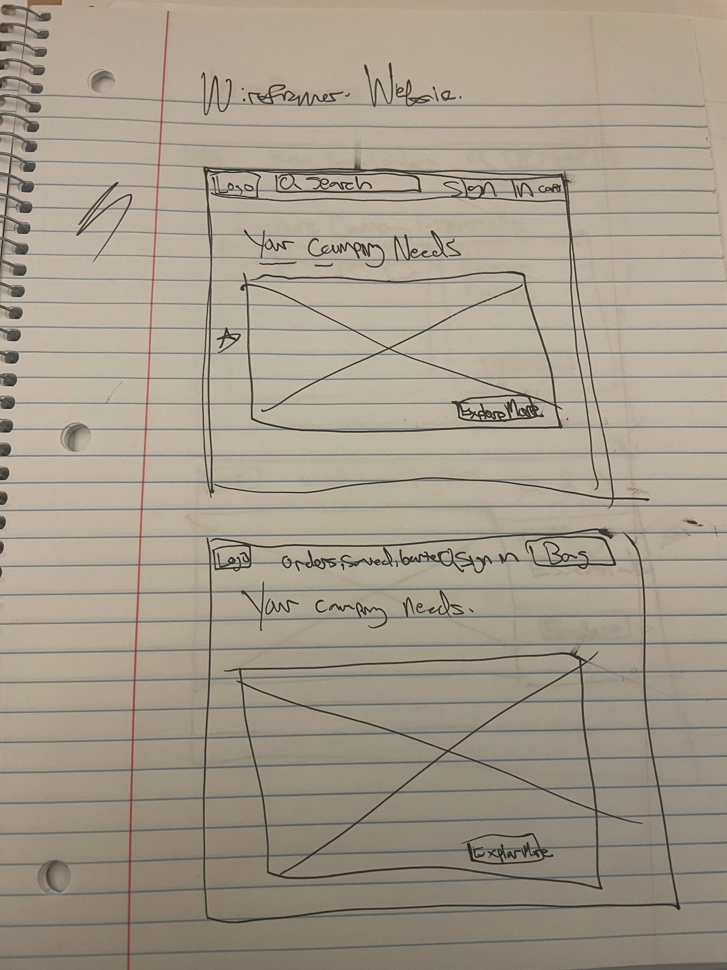
Wireframes
The beginning of my design.
The first step in my design process began by ideating deigns based off of the research I have conducted.
My paper design process included:
Story boarding
Crazy 8s
Paper Wire framing
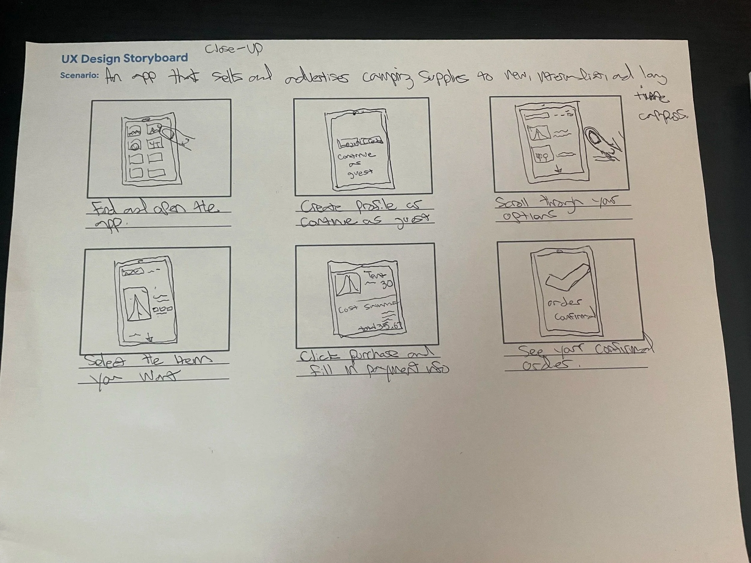
Phone

Wireframes
Thought processes and goals.
My thought process throughout the first set of designs was to make something that is intuitive, but different than other camping apps. One that featured actual images or photos taken by other campers to bring about a sense of community.
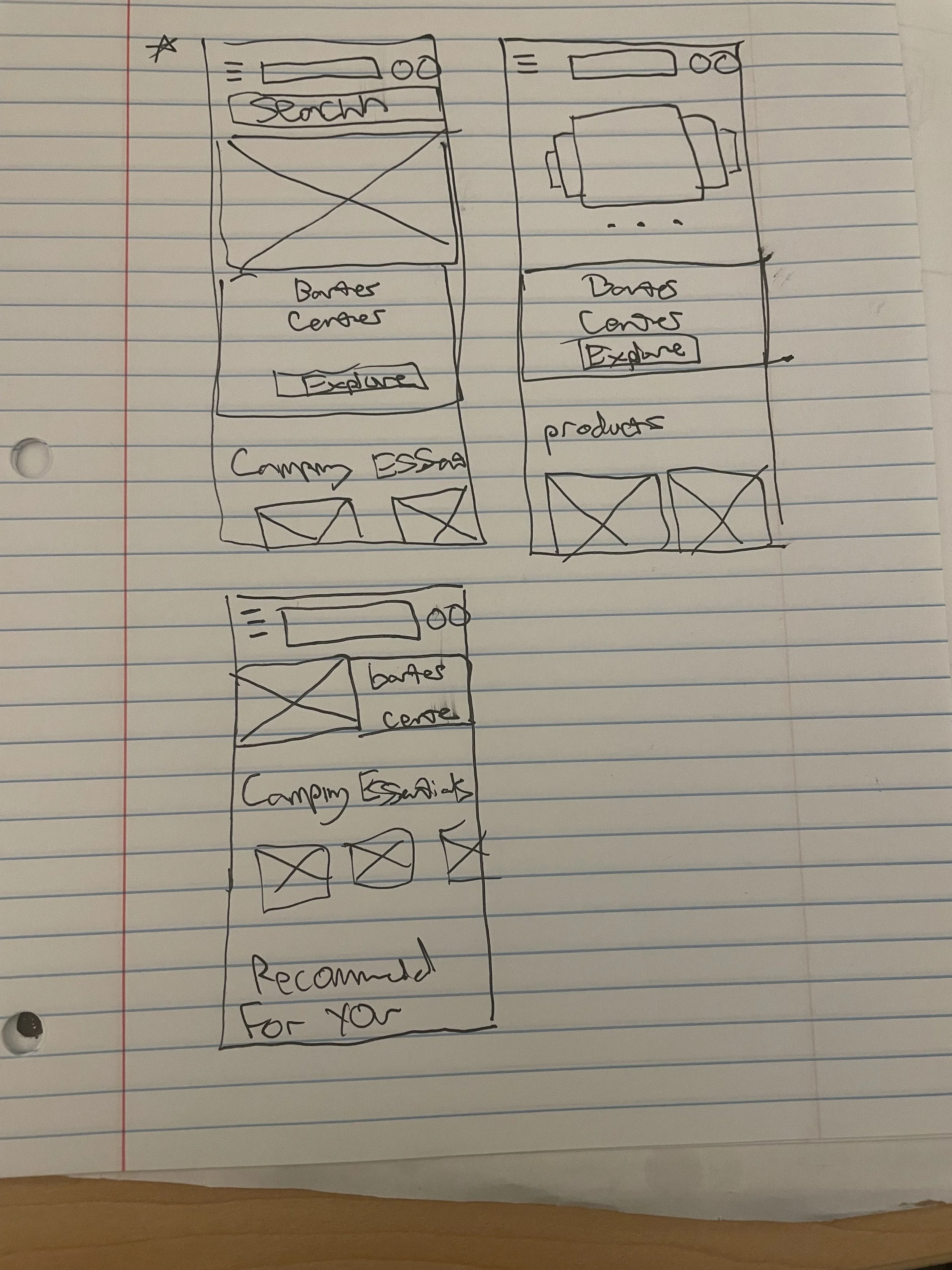
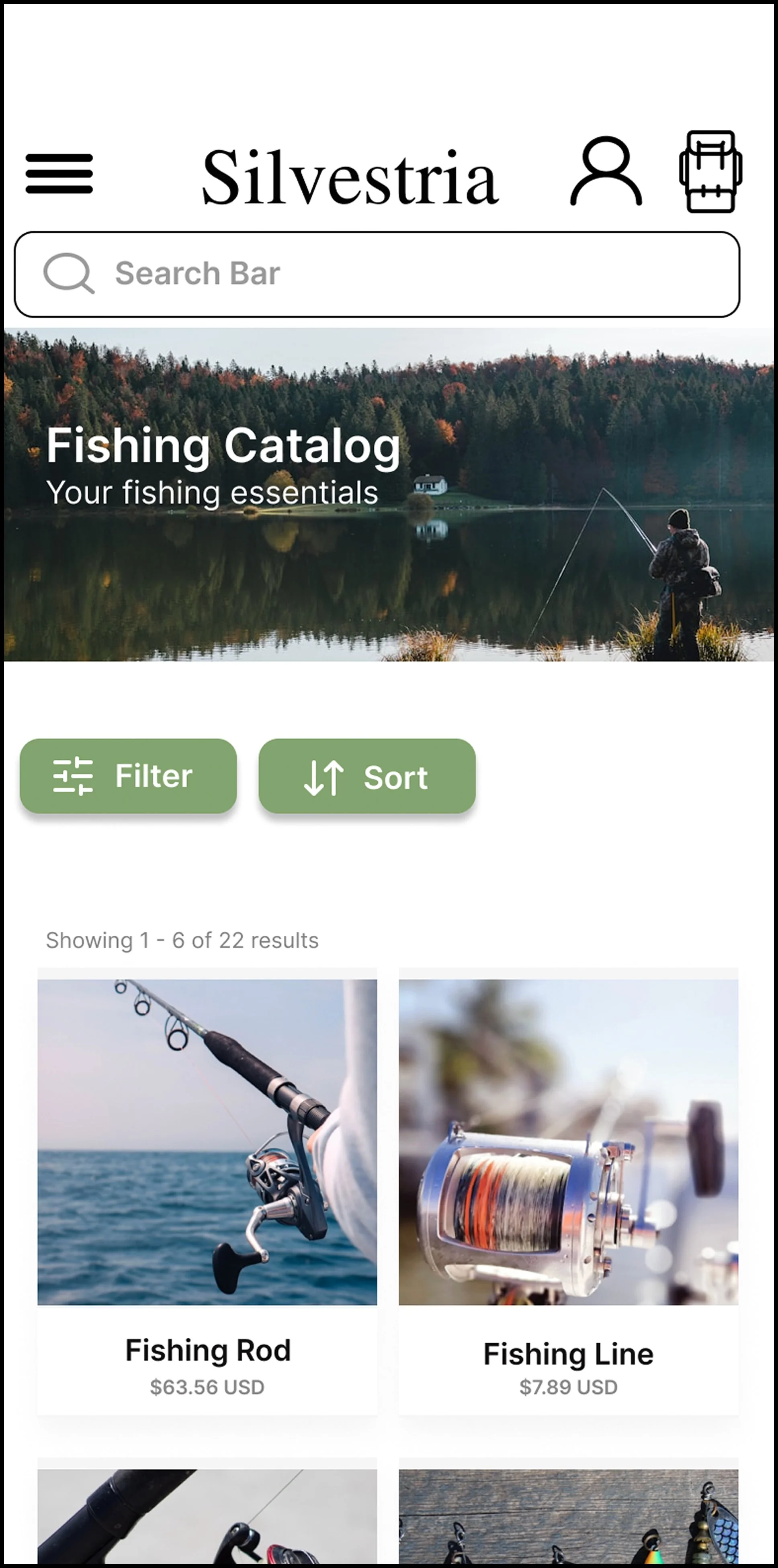
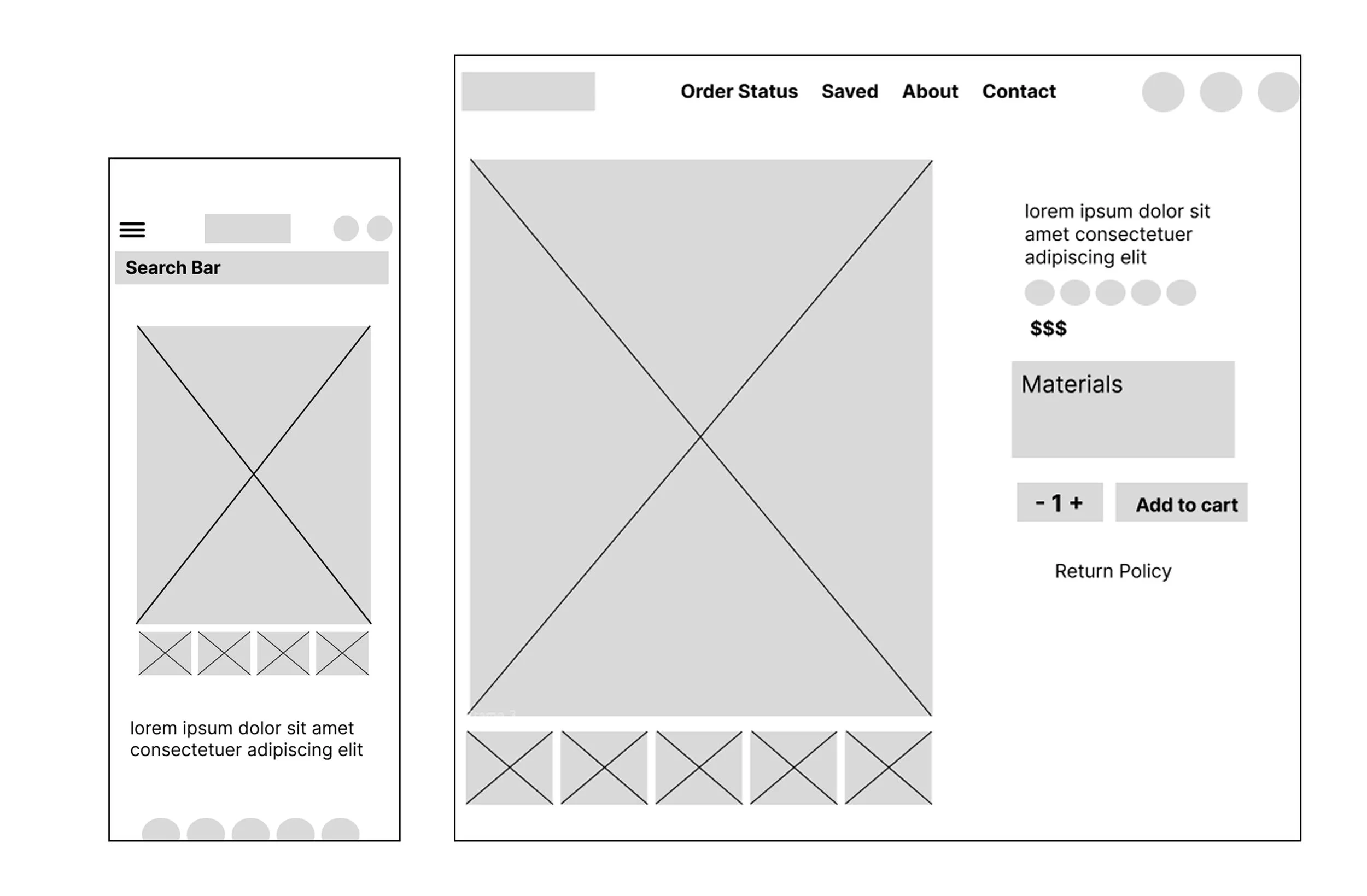
Wireframes
First digital wireframe designs.
With figma, I created my wireframes based off the paper versions I had done earlier.
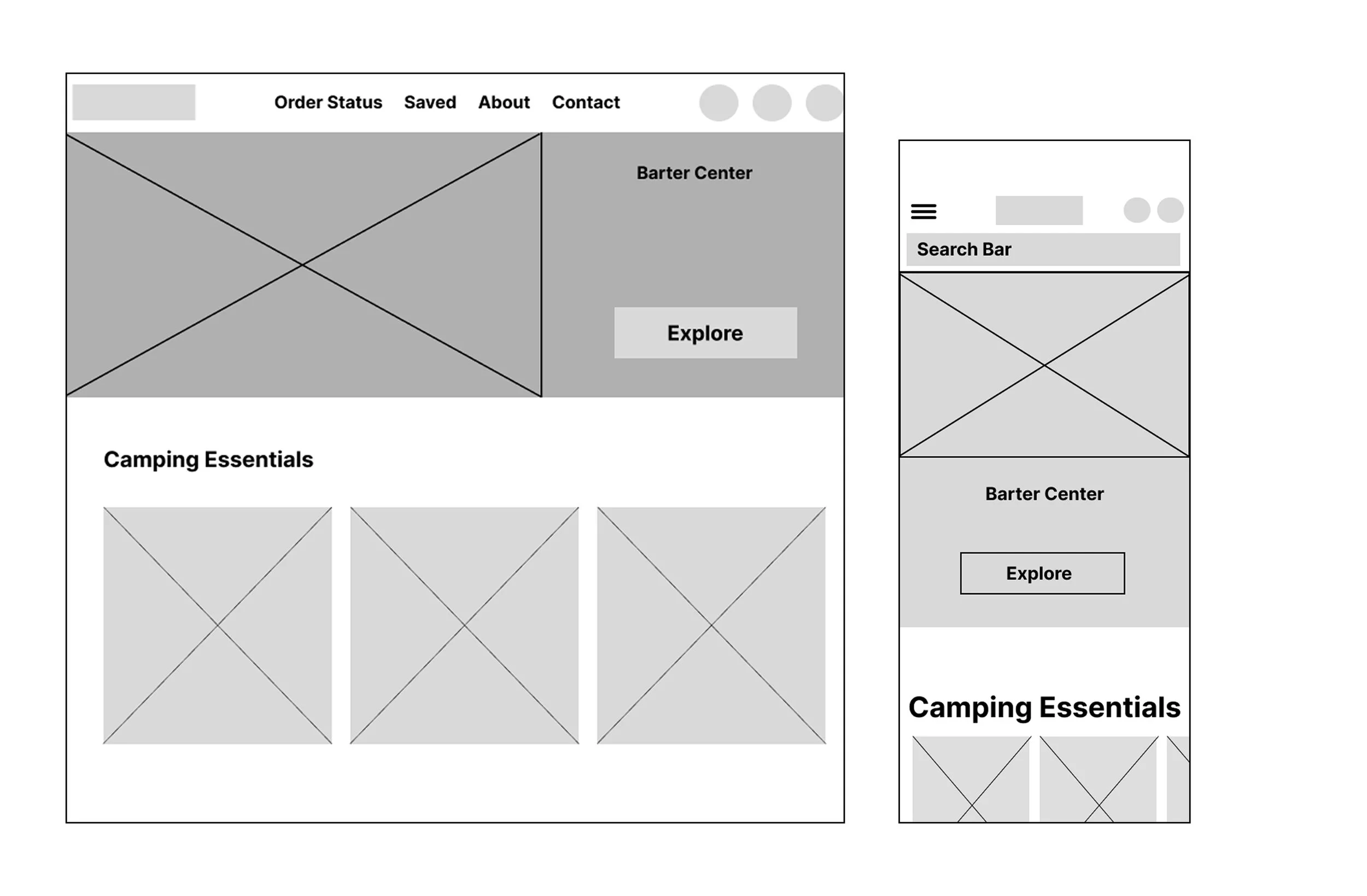
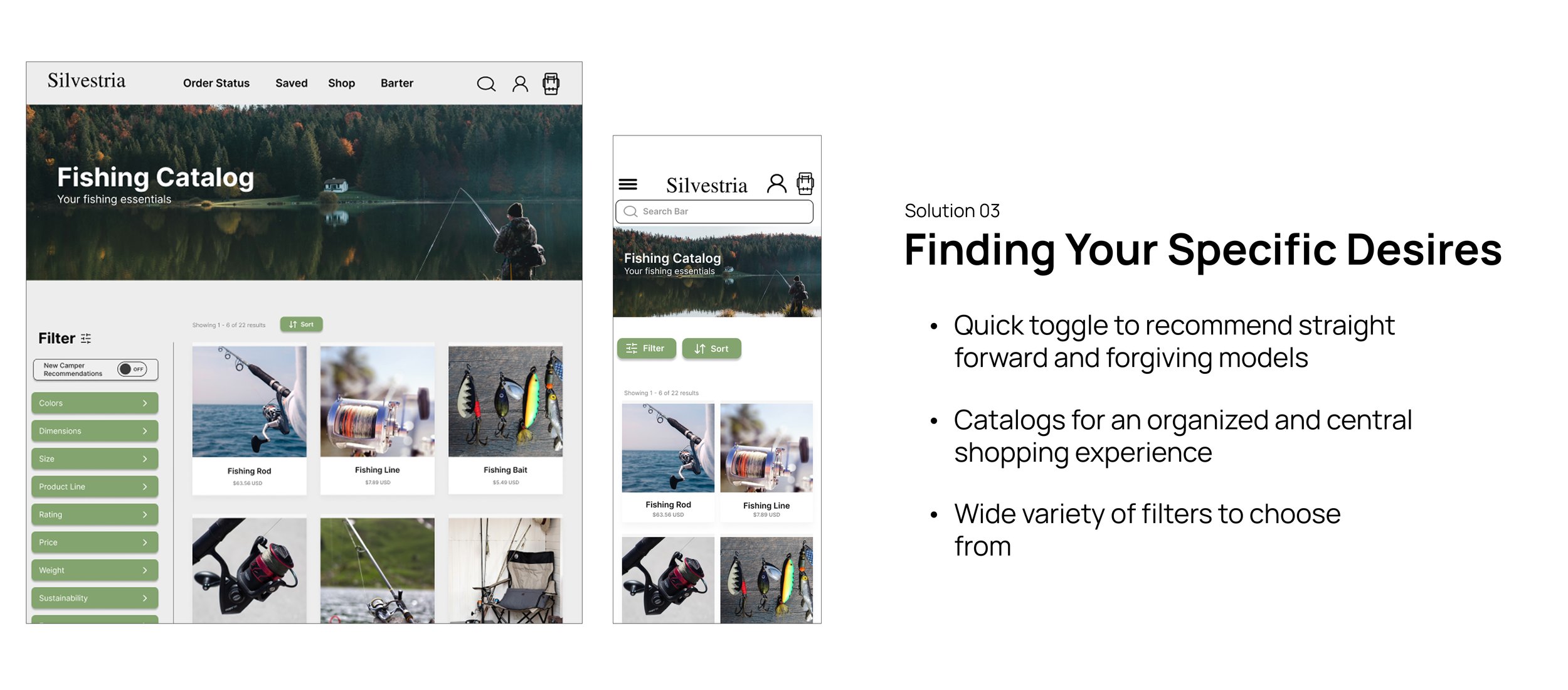
Camping essentials near the top to help get new campers right into the action.
Materials list for the shown product and a return policy link under every item.
Image thumbnails at the bottom of the product for a different angle or photo of the item.
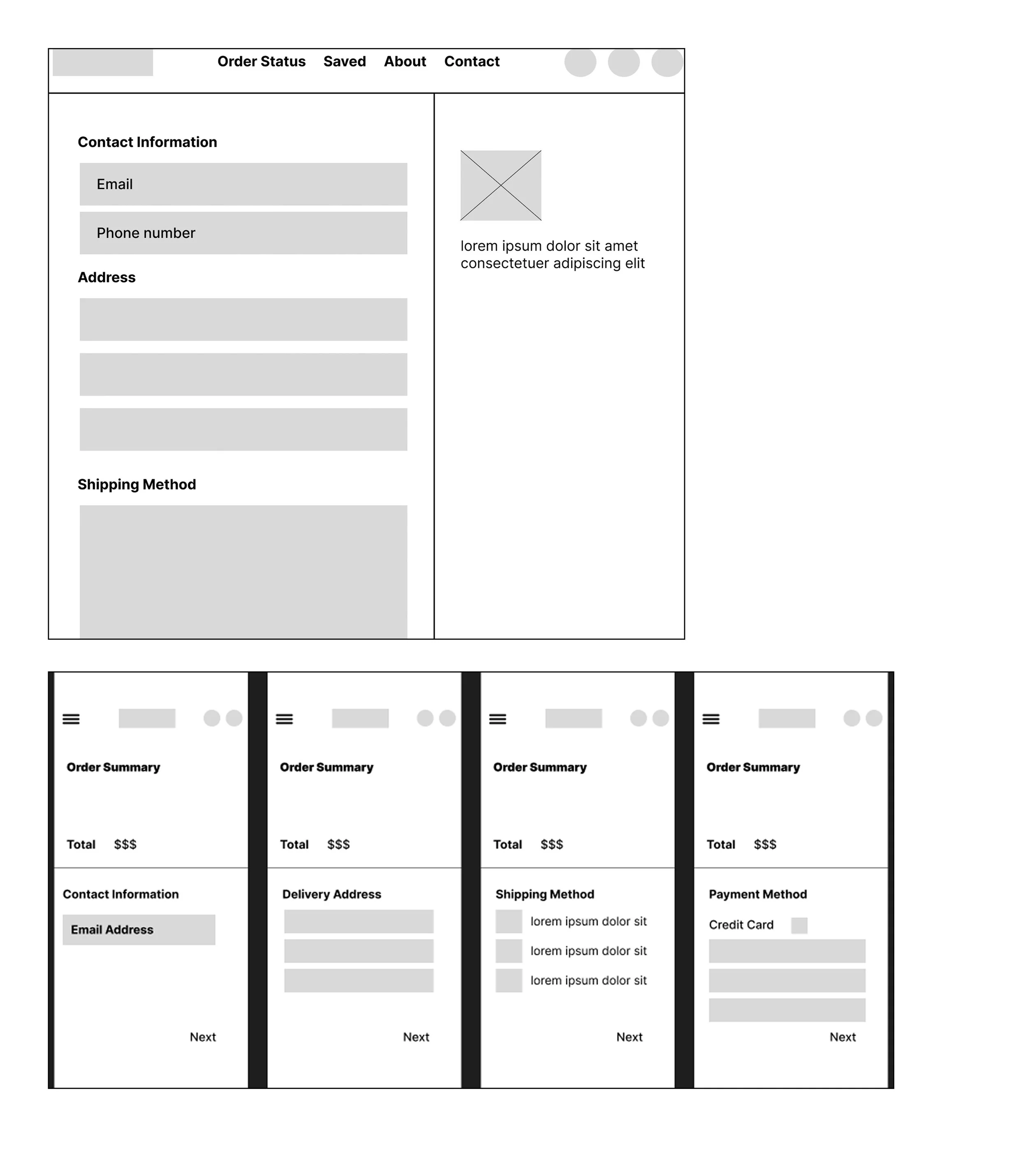
Low-Fidelity Prototypes
An introduction to my low-fidelity prototypes.
The first completed user flow. From checking out a product to viewing the navigation menu, this iteration would be the skeleton for the up and coming main product.
Low-Fidelity Prototypes
First round usability study findings for the low-fidelity prototypes.
The main methodology used to gain insights from participants was an unmoderated usability study. I found my participants through friends, family, UX Design discord communities, and the Google UX Coursera community. There were 5 participants and each interview lasted on average 20 minutes.
Navgiation
Users thought that the navigation options at the top weren’t all useful. Would rather have the “about” and “contact” section in the footer
Main Insights
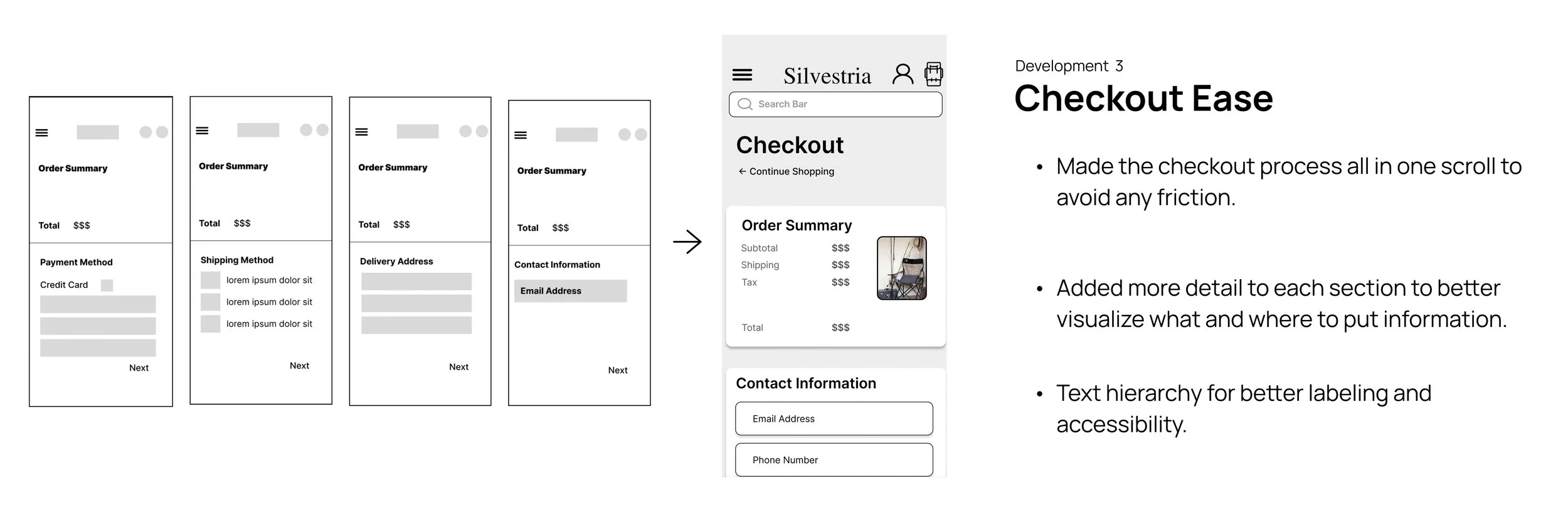
Checkout
Users did not like going through each screen on the mobile version. They preferred if it was all in one scroll.
Lack of Features
Participants thought the lack of features throughout the app was underwhelming and minimal.
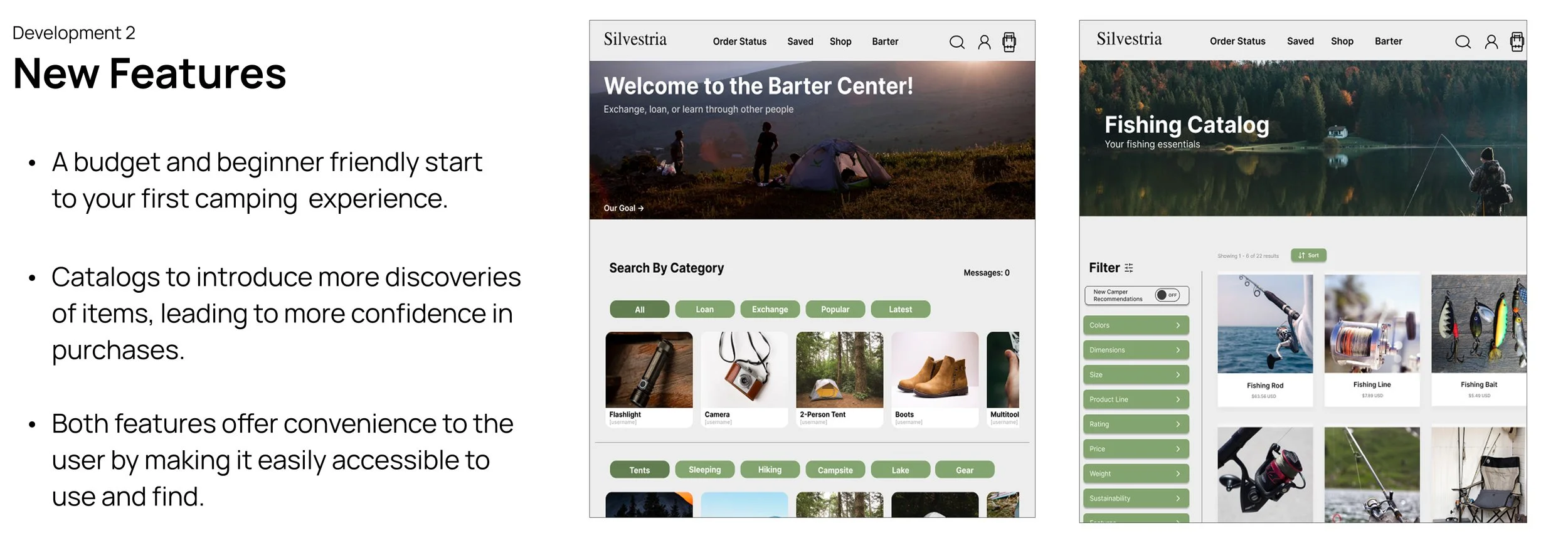
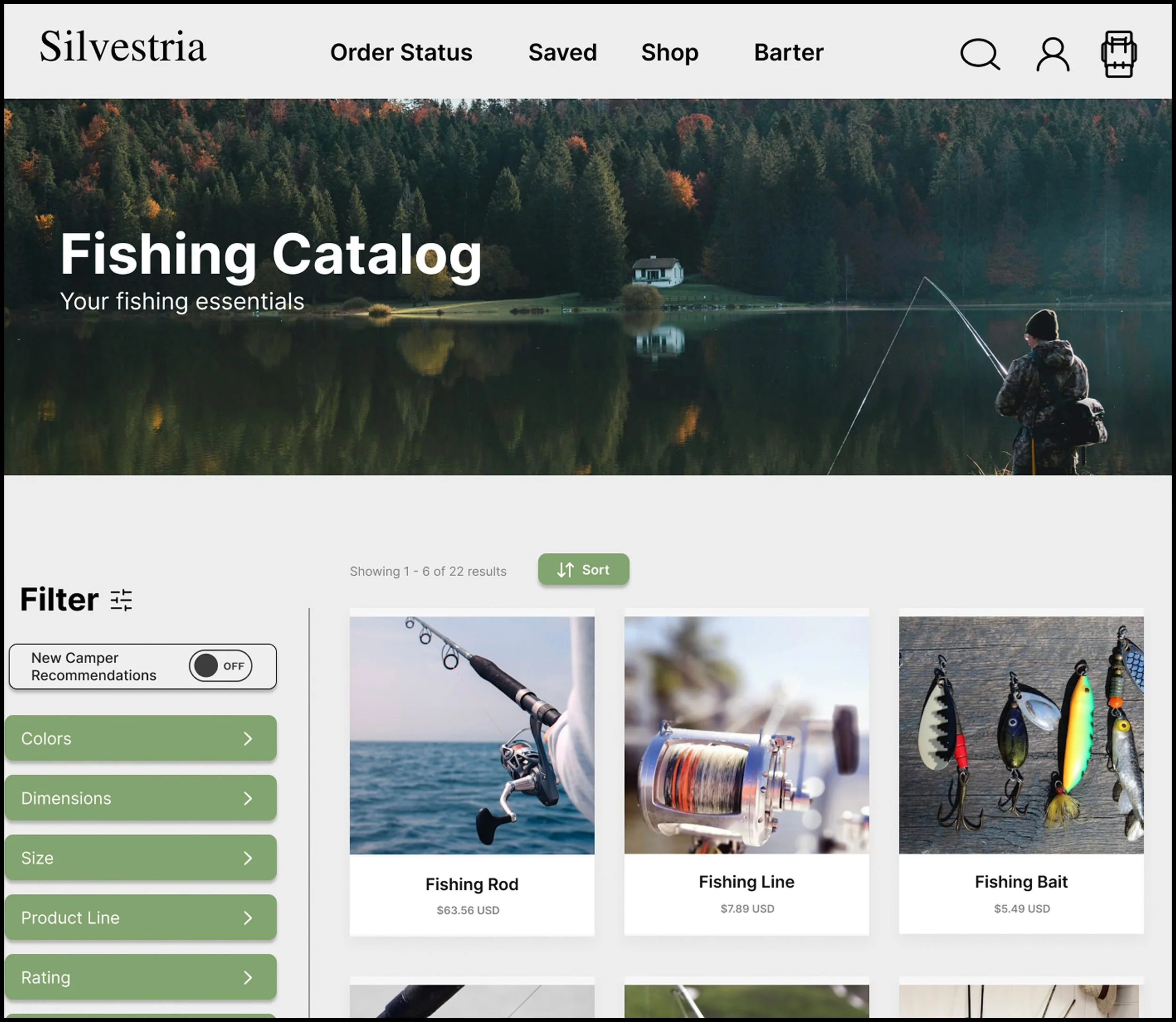
Mockups
3 major developments made in my design.
After receiving feedback from my friends, family, and community based platforms on my prototype, I iterated my design to match what I had envisioned. Here are the 3 major developments I had made over 5 weeks of recycling through different colors, features, and UI’s.

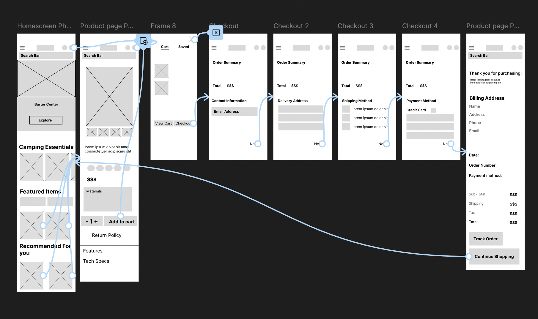
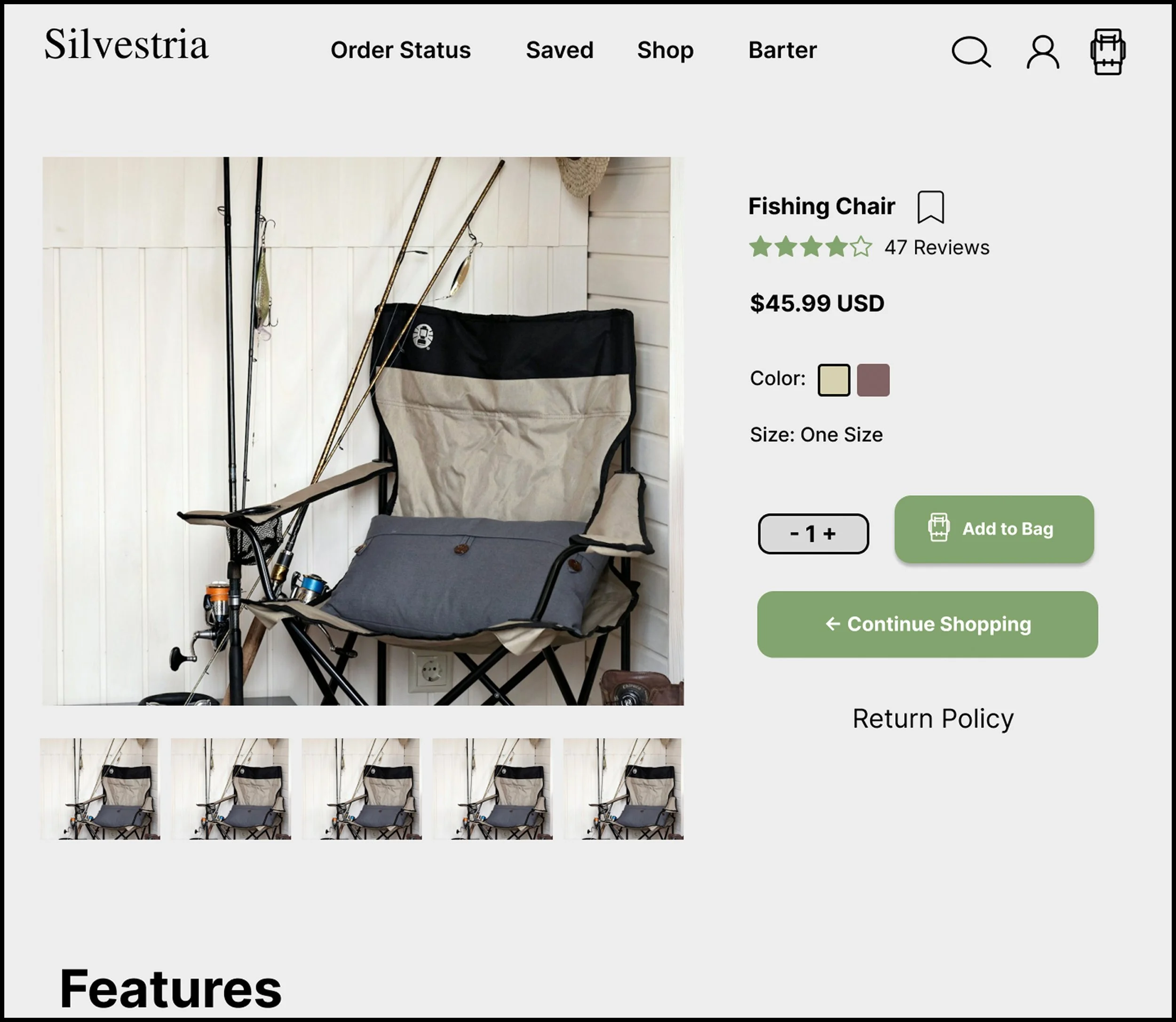
High-Fidelity Prototypes
The final products.


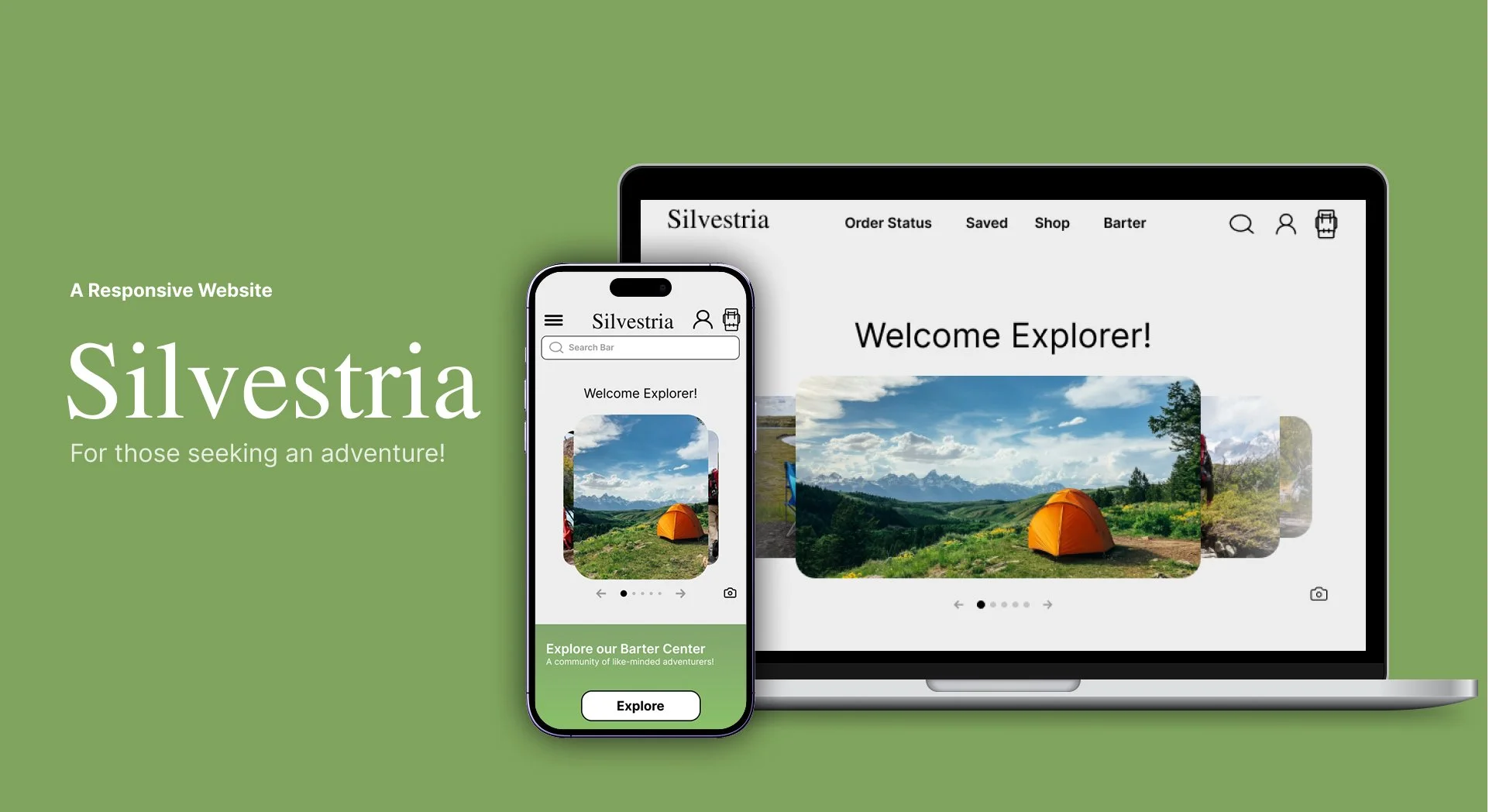
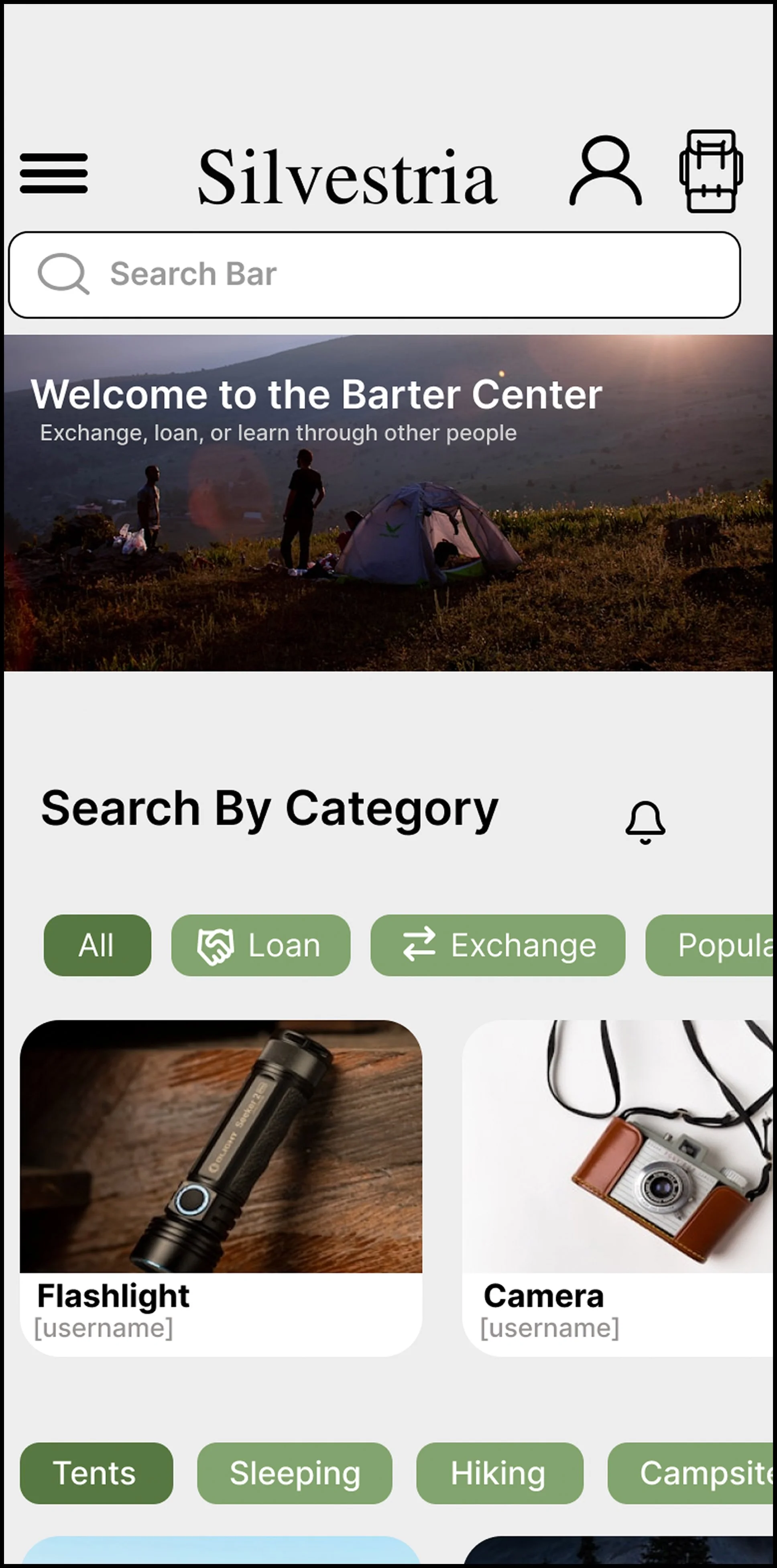
Desktop
High-Fidelity Prototypes
Design system and final prototype.

Conclusion + Key Takeaways
What I gained from this experience.
Understanding how to scale down designs for specific devices or platforms was challenging at first. However, after lots of trial and errors, I slowly got the hang of it and designed a website version of my app, Silvestria.
Impact:
“The flow gave a sense of ease — no unnecessary screens or hurdles. The product image & details in the bag/order summary reinforced confidence in the purchase.” - Participant
“Everything clear here. I love that I can see my adress and can change it because if im not at the same place all the time I can easily remember to change the adress of deliver.” - Participant

Desktop


What I learned:
I learned the different techniques when it comes to scaling down or scaling up visuals. On top of that, I learned how to scale things appropriately, so no matter the scaling size, it flows intuitively and nicely.
What I would do differently next time.
I would provide myself clearer guidelines for the visuals. I did not write any notes of documentation down to address engineers or even myself of the specifics to follow by. Having a clear guideline throughout the design process will help make the product go that extra step.
Lets Connect!
I enjoy working with others on UX design and research ideas. I'd be delighted to discuss opportunities, offer insights, or simply share ideas with you, whether you're a recruiter, designer, or fellow student.
Email: tylerjohansenux34@gmail.com
Thank you for Reading!
Billing Information with product image and summary on the left.
Desktop is one scroll while the phone version are multiple screens/ clicks to get to the order confirmation.